Hi Friends!
Now that you’ve seen the 3 banners for church develop individually, I’d like to explain a little more about the inspirations, and also tell you some of the hidden secrets!
 |
| A stained glass window at church, with some of the symbols of Rocco: Hat, dog, staff. |
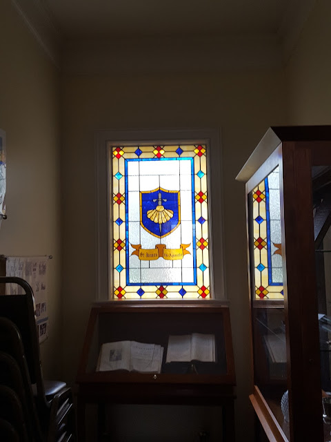
One of the inspirations was too look at some of the symbology already present in the church, and the histories of the saints themselves.
 |
| The St. James window, with the scallop and sword. |
Another resource was looking at banners I could take inspiration from. I traveled to Valparaiso around the time I started the project, and initially, this banner caught my eye, for some techniques (not design).
 |
| This banner has lots of texture. Couched threads, textured fabrics, smooth fabrics, and metallic threads all play a role. |
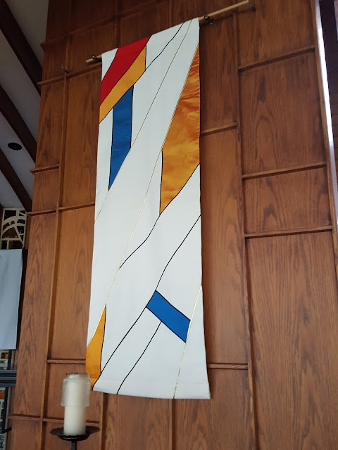
However, as I was shown the University Chapel at Valparaiso, there was one banner set that really started catching my eye. Not only were they neat on their own, they gave me clues about how to make several banners look like they belonged together.
By looking at this banner set, I learned that you could use several motifs (light, ribbons, and a scene) and by having them cross over multiple banners, and using a piecing technique to bring in multiple colors, you could still get a set.
I hope you can see that happening here too:
The following info is what I shared with the congregation about some of the hidden features and details of the set.
The Saint Banners: Did You Notice?
St. James
– The red cross actually contains some of his other symbols: the bottom is the pointed sword, and the top and sides represent his scallop(s)
– The red shield is in homage to the St. James Church coat of arms, which is a red shield with three scallops and a sword
St. Andrew
– Some of the blue fabrics have a nautical theme. Bonus if you notice what’s on the period on the word “St.”!
– The overall color is blue because that reinforces the nautical/fisherman theme
– The fish actually has scales, if you look closely. They are made of glitter on a see-through fabric, but the glitter is trapped because I used the fabric upside-down!
– The fish also has an eye
– The net has three ropes, representing the Trinity
– Can you see the St. Andrew’s cross? It isn’t actually made of fabric, but the negative image of the cross is formed by the blue squares, outlining the white saltire
St. Rocco
– This dog is copied directly from a medieval drawing, since St. Rocco lived in the middle ages, including the style of his eye and his collar
– There is a cross on the loaf of bread
All Three: Similarities
– The overall style is similar: the use of bold color and blocks/squares for much of the design
– All are abstract to some degree
– All have an animal
– None have humans
– Each has at least one human tool
– All use a silver fabric (sword for James, fish for Andrew, dog for Rocco)
– All are the same size and use the same background/base fabric
– All three have some form of cross
All Three: Differences
– None share any colored fabrics
– Each has a different featured color (Reds for James, Blue for Andrew, and Green for Rocco)
– Each has a different featured shape (triangle for James, diamond/X for Andrew, and
upside-down V/square for Rocco)
Yours,
Sarah
To subscribe, find the “subscribe by email” note in the left column and enter your email there.
Posts will be emailed directly to you whenever I post them!
Resource list: Visit my spreadsheet at www.tinyurl.com/infantloss


